E’tsho New Logo concept
The Name E’tsho
E’tsho is a Setswana word describing something that is OURS. We believe that the company truly belongs to our shareholders, our employees, our partners, our clients, our stakeholders and our continent.
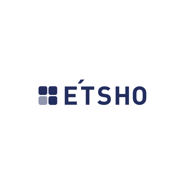
Option 1 Rational:
Option 1 is a clean up of the existing logo. Removing all unnecessary elements that had no meaning, but keeping the same structure. Font change very crucial to the change of this logo, it needed to be a much stronger and stable font. E’tsho needs to come across as reliable and strong, thus the choice of ‘Adihaus’ font. Turning the diamond shapes into more square structure to emphase a strong fondation as well as the upward pointing arrow using one different colour, giving the sense of success and growth.
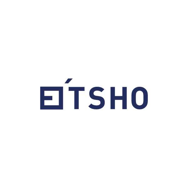
Option 2 Rational:
Option 2 is the modern look. I do realize that E’tsho wants to keep the diamond shape as an icon, but i strongly sugguest a better icon, something new modern and different, a symbol that resembles everything E’tsho stands for and when any person that has come across E’tsho will remember all the great work and service just through one symbol when they see it again.
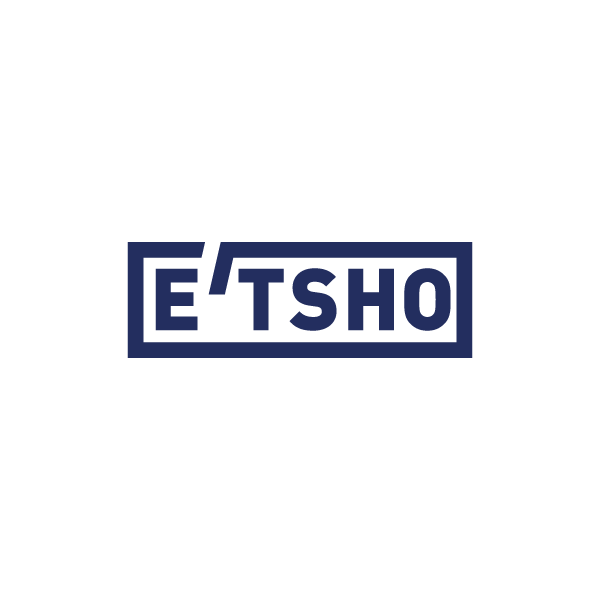
Option 3 Rational:
Option 3 is everything what E’tsho stands for “OUR COMPANY”. The closed yet openness of the logo, strong bold lines, signifying our Independance and strength Its really what our new South Africas is all about. The logo it’self is an icon and is definitely worth standing on the global stage.